I thought that this project was a lot of fun because it required us to use all of our skills for the course. It interested me using our logo and seeing what pictures worked with our project. The hardest part about this project for me was the brochure. It was hard to get the folds right between the writing. Another hard part was doing my business cards without the bleed. One mistake I made was relying on Staples to do my business card. They back and front do not line up properly so the card is not the correct size. Being a business major I like how we used our business ideas but I also think I got more distracted by writing things for my business rather than designing the project. I enjoyed how easy my logo is to move around an make small. I used just the key as bullet points and for other uses. It was nice to have such a usable logo. Another issue I ran into was how things looked great on the computer but once printed looked pretty pixelated. This project was very fun and I plan to take a class with Professor Corrigan again!
Good Golly it's Garrett's ART 210 Blog
Monday, December 9, 2013
Tuesday, November 19, 2013
Monday, November 18, 2013
1) What is your business?
We save people time and money by storing and distributing their keys on demand.
2) Describe your business in one sentence
We save people time and money by storing and distributing their keys on demand.
2) Describe your business in one sentence
Our customers send us their spare vehicle keys in the mail and we distribute the keys to them at anytime and any where they need them.
3) Who is your target audience?
My target audience is anyone who uses a vehicle and drives more than 20,000 miles a year. Men and Women over the age of 16.
4) Who are your competitors?
Companies such as lock smiths that can make my customers a new car key rather than them having remote storage with KeyKeeper
5) What makes them better/worse than your product/service?
One thing they may have an advantage with is speed. There are locksmith services in any state in the US but if the customer requests their keys KeyKeeper is stuck with the speed of our mail service. KeyKeeper is at an advantage because the key to customer strategy we use is way more cost effective for us as a business and the customer.
1) How do you want your image to be seen in two years?
I want people to view KeyKeeper as a very helpful easy to use business that will save them money.
2) If your company was an animal, what animal would it be and why?
I would call my company an eagle because our name will be all over the US because we have to send keys out anywhere the customer requests. Our warehouse in Nebraska is like the nest and the eagle is the mail service that gets the keys to the customers!
3) If your company/brand was a person, who would it be and why?
Like the eagle reference my business could be seen as Forest Gump when he ran across the US. We ship anywhere the customer needs to satisfy there key needs!
4) If your company/brand was an object, what would it be?
A key!
5) If your customer was a cartoon character, who would it be?
It would be the Road Runner. Always running around the roads and moving with speed and accuracy just like KeyKeeper.
Wednesday, November 13, 2013
I love you like a fat kid loves cake!
Monday, November 4, 2013
An awkward beach...
The hardest part about this project was trying to make the beach and water into a gradient. I did not understand in class when we discussed how to make gradients within in object, so every time I made a gradient it filled the entire layer. Because of this the beach and the water look very fake. Because the sky was the farthest layer I was still able to use a gradient. I made a brush for the clouds, even though the given brushes would have worked fine. I would like to learn more about making objects and putting color within them.
Monday, October 28, 2013
I chose to put my self jumping over a great white shark on a wakeboard. The hardest part of this project was increasing the size of the shark picture and then reproducing the sky. I've used photoshop a number of times before so this project was not to challenging. I like sharks and I like wakeboarding so these pictures worked great for me.
Wednesday, October 23, 2013
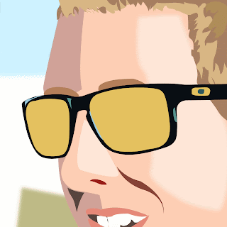
I chose to draw my own face! The hardest part about this project was definitely the reflection in the glasses. I chose this picture because I knew it would be a challenge with the shadows. I chose the colors I though matched the picture the best. The glasses were also hard but I thought it was a fun project!
Subscribe to:
Posts (Atom)


